The Elements of Storytelling: İntrotema’s New Brand Architecture
Since our inception, İntrotema has been a bridge between cultures, starting with copyright management and translation services. However, stories—and the way we tell them—are living things. Over the past few years, our agency has grown beyond its original borders, expanding rapidly into media licensing, digital content, and creative production.
As we expanded, we realized that our existing shell could no longer contain everything we have become. Today, we are proud to unveil a new brand architecture that reflects not just who we are, but where we are going.
Why the Change?
Our previous identity, "Copyright and Translation Agency," served us well, but it became too narrow for the reality of our work. With the rise of our media and licensing operations, grouping distinct services under a single title created ambiguity.
To offer clearer communication and deeper specialization, we have transitioned to a multi-disciplinary structure under the parent identity of İntrotema Agency. This change aligns us with global industry standards, allowing each department to shine in its own specific lane while remaining part of the same family.
The New Architecture: Elemental Harmony
We didn't just change names; we built a philosophy. Each of our three core sub-brands is now represented by a natural element that embodies its specific character and workflow.
1. İntrotema Literary Agency
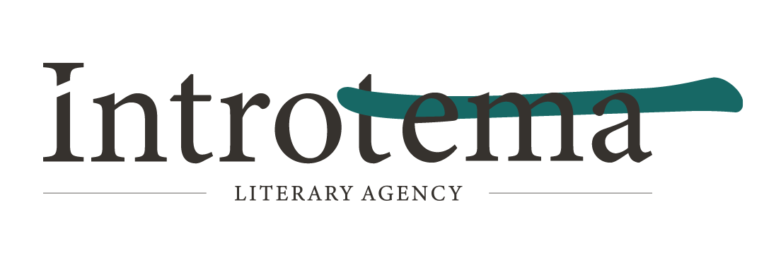
The Element of Air: Air represents thought, imagination, and the invisible flow of ideas. Literature is the realm of the mind, where concepts travel across borders.
Represented by a fresh Pastel Green, this division remains the heart of our operations, managing copyrights and representing authors in the global marketplace. It is the breath of creativity that fuels the industry.
2. İntrotema Translations
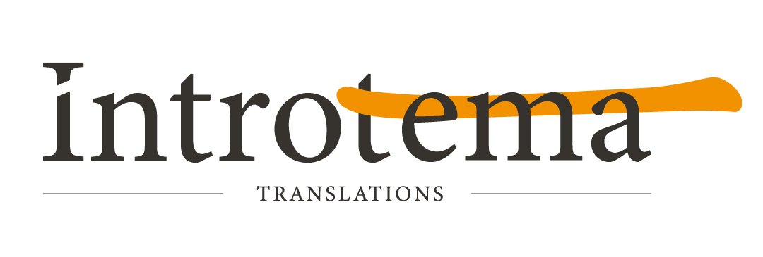
The Element of Earth: Earth signifies stability, structure, and productivity. Translation is the foundational infrastructure of cultural exchange—it requires precision, reliability, and a solid grounding.
Represented by a warm Pastel Orange, "Translations" (plural) emphasizes the sheer volume and variety of languages we construct. From technical texts to creative fiction, this is the ground we build upon.
3. İntrotema Studios
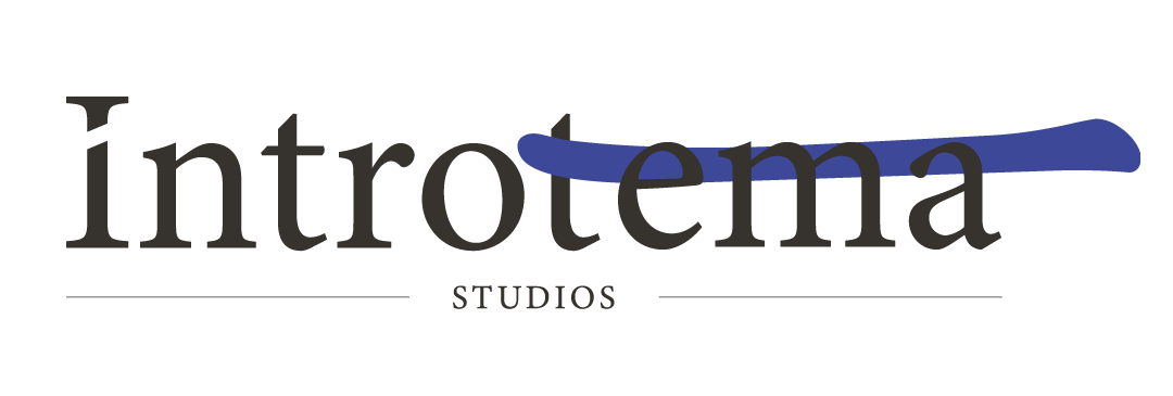
The Element of Water: Water is fluid, adaptable, and constantly moving. It takes the shape of its container, much like stories adapted for screen, animation, and digital media.
Represented by a deep Navy Blue, İntrotema Studios is our gateway to the screen industry. This division handles media rights, film & TV licensing, and content development, reflecting the fluid nature of modern entertainment.
A Unified Future
While our departments now have distinct identities, they are all fueled by the same source: the Fire of the main İntrotema brand. This represents our leadership, energy, and the passion that sparked this journey in the first place.
We are excited to step into this new era with a clearer vision, ready to connect cultures through books, languages, and screens more effectively than ever before.